Modern Website Colour Theme Switcher with only HTML and CSS
I recently found time to watch a very insightful, fast-paced presentation by Adam Argyle titled “25 New & Rad Features of CSS”.
Watch here: 25 new & rad features of CSS by Adam Argyle
After just five minutes, when he demonstrated the use case of @view-transition { navigation: auto; } and the whole crowd reacted positively, I was hooked and watched until the end.
I learned a great deal and implemented many of the features mentioned in my websites. Some of them I had heard of before, but I am not keen to implement everything straight away. When technologies are still at the early stage of adoption in web browsers, I tend to wait. The problem is that later I often forget about them, which is why Adam’s presentation reminded me of some of the concepts I had already come across.
One of these was the use of color-scheme: light dark; and the light-dark() syntax approach for light and dark colours.
On my website, I implemented a three-way colour switcher some time ago. However, this relied heavily on JavaScript and CSS rules that needed to be duplicated to achieve the intended output.
With the adoption of light-dark, it was time for me to move away from that approach and convert my three-way colour theme switcher into HTML and CSS only.
I added minimal JavaScript — optional, yet useful from the user’s perspective.
I was amazed by how easy the conversion was, and that the functionality for users remained unchanged. To be honest, I doubt anybody noticed any differences. The improvement is most evident in the simplicity of my CSS on my end, but for an ordinary visitor, it is business as usual.
Let’s take a look at my implementation.
Feel free to use it on your own website :)
CSS – prefers-color-scheme (backwards compatibility)
Before I implemented the new light-dark() approach for light and dark mode on my website, I asked myself two questions:
- Will this work for users who are not on the latest browser?
- Will the colours still display as intended?
The answer was no.
Because of that, I needed to ensure backwards compatibility for as long as necessary.
I placed my colours within the :root {} element in my CSS. By default, everything in that element refers to light colours. I then specified the option for the dark theme using a @media query, as I have been doing for some time.
In standard form, it looks like this:
/* Light theme (default) - Fallbacks for browsers that don't support anything */
:root {
  --main: #137faa;
}

/* Dark theme - Fallback for browsers that support media queries but not light-dark() */
@media (prefers-color-scheme: dark) {
    :root {
      --main: #2EBAE0;
    }
}
The --main variable is a defined parameter for my primary colour, which I later use in my CSS as follows:
.article-entry p > a {
  color: var(--main);
}
That works just as it did before. When a user sets their device to light mode, they are served the primary colour #137faa. When they switch to dark mode, they are served the dark version of the primary colour #2EBAE0.
CSS – color-scheme (future compatibility)
Once the backwards compatibility fallback is in place, it is time to incorporate the new syntax. I am doing this in such a way that it will only be applied when the user’s browser supports color-scheme: light dark; hence the use of the @supports clause and embedding :root {} inside it.
Starting with color-scheme: light dark;, we then focus on predefining parameters used throughout the styles.
/* New syntax for modern browsers */
/* This block will be read by modern browsers and override the fallbacks */
@supports (color-scheme: light dark) {
  :root {
    color-scheme: light dark;

    --main: light-dark(#137faa, #2EBAE0);
  }
}
As you can see, the syntax light-dark(#137faa, #2EBAE0); is much simpler. When applied to a light theme, it uses #137faa for the primary colour, and when switched to dark mode, it applies #2EBAE0 as the dark variant.
This approach is simple yet powerful, allowing you to keep your CSS far tidier and clearly distinguish where colours switch and where permanent colours are applied.
Now it’s time to work on our colour theme switcher.
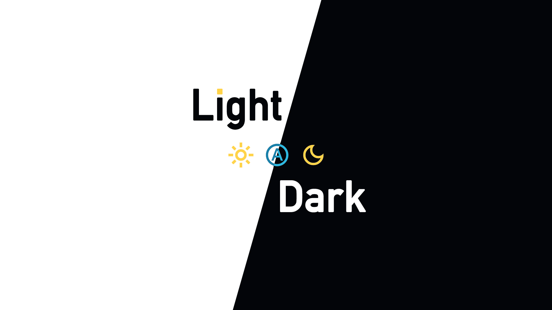
HTML – three-way colour theme switcher
My previous colour switcher was based on The Best Light/Dark Mode Theme Toggle in JavaScript by Salma Alma-Naylor and It’s Tri-State Switch Time by Bryce Wray.
There is nothing wrong with it, and it works well in both older and modern browsers. The only issue, on my end, was that I needed to consider different ways of serving colours.
For example, when a user has dark mode enabled but wants to switch the website to light mode, or when the site defaults to light mode but the user prefers dark mode.
This introduces a degree of complexity with [data-theme="dark"] and [data-theme="light"]. I have to think in reverse: when the light theme is set on the user’s device but the switcher is set to dark, the :root {} must serve the dark version of the colours, as in that case the @media query contradicts the selected option on the switcher.
I have now decided to remove that complexity, with a small trade-off that I will address later.
My new HTML-only switcher, which does not rely on any JavaScript, looks like this:
<div class="switchTheme">
    <label class="lightLabel" title="{{ T "LightMode" }}">
        <input type="radio" name="switchTheme" value="light" id="lightMode" aria-label="{{ T "SelectLightMode" }}">
        <span class="toggle-switch__control"></span>
    </label>
    <label class="autoLabel" title="{{ T "AutoMode" }}">
        <input type="radio" name="switchTheme" value="light dark" id="autoMode" aria-label="{{ T "SelectAutoMode" }}" checked>
        <span class="toggle-switch__control"></span>
    </label>
    <label class="darkLabel" title="{{ T "DarkMode" }}">
        <input type="radio" name="switchTheme" value="dark" id="darkMode" aria-label="{{ T "SelectDarkMode" }}">
        <span class="toggle-switch__control"></span>
    </label>
</div>
As I use Hugo to build my website, I have incorporated translated elements into
aria-labelandtitle.
i18n\en.toml
[LightMode]
other = "Light mode"
[SelectLightMode]
other = "Select light mode"
[AutoMode]
other = "Auto mode"
[SelectAutoMode]
other = "Select light or dark mode automatically"
[DarkMode]
other = "Dark mode"
[SelectDarkMode]
other = "Select dark mode"
Modifying my switcher to the new approach does not require me to change (almost) any of my original CSS code.
elements of switchTheme from style.css
/* tri-state darkmode switch toggle HTML CSS only */

.switchTheme {
	display: flex; /* only this will be moved further */
	flex-direction: row;
	gap: 0;
  white-space: nowrap;
  width: 6rem;
  justify-content: space-around;
}

.lightLabel,
.autoLabel,
.darkLabel {
  display: inline-block;
}

.switchTheme input[type="radio"] {
  display: none;
}

.switchTheme svg {
  fill: var(--black);
  height: 1rem;
  width: 1rem;
}

/* sun */
#lightMode + .toggle-switch__control::after {
  height: 1.5rem;
  width: 1.5rem;
  display: block;
  content: '';
  -webkit-mask: url("data:image/svg+xml;charset=UTF-8,<svg xmlns='http://www.w3.org/2000/svg' viewBox='0 -960 960 960'><path d='M480-360q50 0 85-35t35-85q0-50-35-85t-85-35q-50 0-85 35t-35 85q0 50 35 85t85 35Zm0 80q-83 0-141.5-58.5T280-480q0-83 58.5-141.5T480-680q83 0 141.5 58.5T680-480q0 83-58.5 141.5T480-280ZM200-440H40v-80h160v80Zm720 0H760v-80h160v80ZM440-760v-160h80v160h-80Zm0 720v-160h80v160h-80ZM256-650l-101-97 57-59 96 100-52 56Zm492 496-97-101 53-55 101 97-57 59Zm-98-550 97-101 59 57-100 96-56-52ZM154-212l101-97 55 53-97 101-59-57Zm326-268Z'/></svg>") no-repeat 50% 50%;
  mask: url("data:image/svg+xml;charset=UTF-8,<svg xmlns='http://www.w3.org/2000/svg' viewBox='0 -960 960 960'><path d='M480-360q50 0 85-35t35-85q0-50-35-85t-85-35q-50 0-85 35t-35 85q0 50 35 85t85 35Zm0 80q-83 0-141.5-58.5T280-480q0-83 58.5-141.5T480-680q83 0 141.5 58.5T680-480q0 83-58.5 141.5T480-280ZM200-440H40v-80h160v80Zm720 0H760v-80h160v80ZM440-760v-160h80v160h-80Zm0 720v-160h80v160h-80ZM256-650l-101-97 57-59 96 100-52 56Zm492 496-97-101 53-55 101 97-57 59Zm-98-550 97-101 59 57-100 96-56-52ZM154-212l101-97 55 53-97 101-59-57Zm326-268Z'/></svg>") no-repeat 50% 50%;
  -webkit-mask-size: cover;
  mask-size: cover;
  background-color: var(--nightgray);
}

/* auto */
#autoMode + .toggle-switch__control::after {
  height: 1.5rem;
  width: 1.5rem;
  display: block;
  content: '';
  -webkit-mask: url("data:image/svg+xml;charset=UTF-8,<svg xmlns='http://www.w3.org/2000/svg' viewBox='0 -960 960 960'><path d='M276-280h76l40-112h176l40 112h76L520-720h-80L276-280Zm138-176 64-182h4l64 182H414Zm66 376q-83 0-156-31.5T197-197q-54-54-85.5-127T80-480q0-83 31.5-156T197-763q54-54 127-85.5T480-880q83 0 156 31.5T763-763q54 54 85.5 127T880-480q0 83-31.5 156T763-197q-54 54-127 85.5T480-80Zm0-400Zm0 320q133 0 226.5-93.5T800-480q0-133-93.5-226.5T480-800q-133 0-226.5 93.5T160-480q0 133 93.5 226.5T480-160Z'/></svg>") no-repeat 50% 50%;
  mask: url("data:image/svg+xml;charset=UTF-8,<svg xmlns='http://www.w3.org/2000/svg' viewBox='0 -960 960 960'><path d='M276-280h76l40-112h176l40 112h76L520-720h-80L276-280Zm138-176 64-182h4l64 182H414Zm66 376q-83 0-156-31.5T197-197q-54-54-85.5-127T80-480q0-83 31.5-156T197-763q54-54 127-85.5T480-880q83 0 156 31.5T763-763q54 54 85.5 127T880-480q0 83-31.5 156T763-197q-54 54-127 85.5T480-80Zm0-400Zm0 320q133 0 226.5-93.5T800-480q0-133-93.5-226.5T480-800q-133 0-226.5 93.5T160-480q0 133 93.5 226.5T480-160Z'/></svg>") no-repeat 50% 50%;
  -webkit-mask-size: cover;
  mask-size: cover;
  background-color: var(--nightgray);
}

/* moon */
#darkMode + .toggle-switch__control::after {
  height: 1.5rem;
  width: 1.5rem;
  display: block;
  content: '';
  -webkit-mask: url("data:image/svg+xml;charset=UTF-8,<svg xmlns='http://www.w3.org/2000/svg' viewBox='0 -960 960 960'><path d='M480-120q-150 0-255-105T120-480q0-150 105-255t255-105q14 0 27.5 1t26.5 3q-41 29-65.5 75.5T444-660q0 90 63 153t153 63q55 0 101-24.5t75-65.5q2 13 3 26.5t1 27.5q0 150-105 255T480-120Zm0-80q88 0 158-48.5T740-375q-20 5-40 8t-40 3q-123 0-209.5-86.5T364-660q0-20 3-40t8-40q-78 32-126.5 102T200-480q0 116 82 198t198 82Zm-10-270Z'/></svg>") no-repeat 50% 50%;
  mask: url("data:image/svg+xml;charset=UTF-8,<svg xmlns='http://www.w3.org/2000/svg' viewBox='0 -960 960 960'><path d='M480-120q-150 0-255-105T120-480q0-150 105-255t255-105q14 0 27.5 1t26.5 3q-41 29-65.5 75.5T444-660q0 90 63 153t153 63q55 0 101-24.5t75-65.5q2 13 3 26.5t1 27.5q0 150-105 255T480-120Zm0-80q88 0 158-48.5T740-375q-20 5-40 8t-40 3q-123 0-209.5-86.5T364-660q0-20 3-40t8-40q-78 32-126.5 102T200-480q0 116 82 198t198 82Zm-10-270Z'/></svg>") no-repeat 50% 50%;
  -webkit-mask-size: cover;
  mask-size: cover;
  background-color: var(--nightgray);
}

/* sun:checked */
#lightMode:checked + .toggle-switch__control::after {
  height: 1.5rem;
  width: 1.5rem;
  display: block;
  content: '';
  -webkit-mask: url("data:image/svg+xml;charset=UTF-8,<svg xmlns='http://www.w3.org/2000/svg' viewBox='0 -960 960 960'><path d='M480-360q50 0 85-35t35-85q0-50-35-85t-85-35q-50 0-85 35t-35 85q0 50 35 85t85 35Zm0 80q-83 0-141.5-58.5T280-480q0-83 58.5-141.5T480-680q83 0 141.5 58.5T680-480q0 83-58.5 141.5T480-280ZM200-440H40v-80h160v80Zm720 0H760v-80h160v80ZM440-760v-160h80v160h-80Zm0 720v-160h80v160h-80ZM256-650l-101-97 57-59 96 100-52 56Zm492 496-97-101 53-55 101 97-57 59Zm-98-550 97-101 59 57-100 96-56-52ZM154-212l101-97 55 53-97 101-59-57Zm326-268Z'/></svg>") no-repeat 50% 50%;
  mask: url("data:image/svg+xml;charset=UTF-8,<svg xmlns='http://www.w3.org/2000/svg' viewBox='0 -960 960 960'><path d='M480-360q50 0 85-35t35-85q0-50-35-85t-85-35q-50 0-85 35t-35 85q0 50 35 85t85 35Zm0 80q-83 0-141.5-58.5T280-480q0-83 58.5-141.5T480-680q83 0 141.5 58.5T680-480q0 83-58.5 141.5T480-280ZM200-440H40v-80h160v80Zm720 0H760v-80h160v80ZM440-760v-160h80v160h-80Zm0 720v-160h80v160h-80ZM256-650l-101-97 57-59 96 100-52 56Zm492 496-97-101 53-55 101 97-57 59Zm-98-550 97-101 59 57-100 96-56-52ZM154-212l101-97 55 53-97 101-59-57Zm326-268Z'/></svg>") no-repeat 50% 50%;
  -webkit-mask-size: cover;
  mask-size: cover;
  background-color: var(--yellow);
}

/* auto:checked */
#autoMode:checked + .toggle-switch__control::after {
  height: 1.5rem;
  width: 1.5rem;
  display: block;
  content: '';
  -webkit-mask: url("data:image/svg+xml;charset=UTF-8,<svg xmlns='http://www.w3.org/2000/svg' viewBox='0 -960 960 960'><path  d='M276-280h76l40-112h176l40 112h76L520-720h-80L276-280Zm138-176 64-182h4l64 182H414Zm66 376q-83 0-156-31.5T197-197q-54-54-85.5-127T80-480q0-83 31.5-156T197-763q54-54 127-85.5T480-880q83 0 156 31.5T763-763q54 54 85.5 127T880-480q0 83-31.5 156T763-197q-54 54-127 85.5T480-80Zm0-400Zm0 320q133 0 226.5-93.5T800-480q0-133-93.5-226.5T480-800q-133 0-226.5 93.5T160-480q0 133 93.5 226.5T480-160Z'/></svg>") no-repeat 50% 50%;
  mask: url("data:image/svg+xml;charset=UTF-8,<svg xmlns='http://www.w3.org/2000/svg' viewBox='0 -960 960 960'><path d='M276-280h76l40-112h176l40 112h76L520-720h-80L276-280Zm138-176 64-182h4l64 182H414Zm66 376q-83 0-156-31.5T197-197q-54-54-85.5-127T80-480q0-83 31.5-156T197-763q54-54 127-85.5T480-880q83 0 156 31.5T763-763q54 54 85.5 127T880-480q0 83-31.5 156T763-197q-54 54-127 85.5T480-80Zm0-400Zm0 320q133 0 226.5-93.5T800-480q0-133-93.5-226.5T480-800q-133 0-226.5 93.5T160-480q0 133 93.5 226.5T480-160Z'/></svg>") no-repeat 50% 50%;
  -webkit-mask-size: cover;
  mask-size: cover;
  background-color: var(--main);
}

/* moon:checked */
#darkMode:checked + .toggle-switch__control::after {
  height: 1.5rem;
  width: 1.5rem;
  display: block;
  content: '';
  -webkit-mask: url("data:image/svg+xml;charset=UTF-8,<svg xmlns='http://www.w3.org/2000/svg' viewBox='0 -960 960 960'><path d='M480-120q-150 0-255-105T120-480q0-150 105-255t255-105q14 0 27.5 1t26.5 3q-41 29-65.5 75.5T444-660q0 90 63 153t153 63q55 0 101-24.5t75-65.5q2 13 3 26.5t1 27.5q0 150-105 255T480-120Zm0-80q88 0 158-48.5T740-375q-20 5-40 8t-40 3q-123 0-209.5-86.5T364-660q0-20 3-40t8-40q-78 32-126.5 102T200-480q0 116 82 198t198 82Zm-10-270Z'/></svg>") no-repeat 50% 50%;
  mask: url("data:image/svg+xml;charset=UTF-8,<svg xmlns='http://www.w3.org/2000/svg' viewBox='0 -960 960 960'><path d='M480-120q-150 0-255-105T120-480q0-150 105-255t255-105q14 0 27.5 1t26.5 3q-41 29-65.5 75.5T444-660q0 90 63 153t153 63q55 0 101-24.5t75-65.5q2 13 3 26.5t1 27.5q0 150-105 255T480-120Zm0-80q88 0 158-48.5T740-375q-20 5-40 8t-40 3q-123 0-209.5-86.5T364-660q0-20 3-40t8-40q-78 32-126.5 102T200-480q0 116 82 198t198 82Zm-10-270Z'/></svg>") no-repeat 50% 50%;
  -webkit-mask-size: cover;
  mask-size: cover;
  background-color: var(--yellow);
}

.toggle-switch__control { cursor: pointer;}

/* END tri-state darkmode switch toggle HTML CSS only  */
Some examples of incorporating the
light-dark()approach and the three-way switcher can be found in the article CSS colour-scheme-dependent colours with light-dark() on web.dev. For a basic understanding of thelight-dark()approach, I strongly recommend reading Trys Mudford’s post on Implementing light-dark().
To make the switcher work, you need to integrate its state with CSS.
CSS for three-way colour theme switcher
Here is the essential part of the CSS that enables the switcher to function based on its state.
  /* When the "Auto" (light dark) radio is checked */
  &:has(input[name="switchTheme"][value="light dark"]:checked) {
    color-scheme: light dark;
  }

  /* When the "Light" radio is checked */
  &:has(input[name="switchTheme"][value="light"]:checked) {
    color-scheme: light;
  }

  /* When the "Dark" radio is checked */
  &:has(input[name="switchTheme"][value="dark"]:checked) {
    color-scheme: dark;
  }
That’s not all.
As I have been considering backwards compatibility, I need to remember that for browsers which do not yet support the light-dark() syntax, my switcher will not work. In such cases, the website’s state (light or dark mode) will rely entirely on the user’s system settings.
CSS – hiding the switcher for outdated browsers
In the case where a user visits my website with an outdated browser, showing the switcher does not make any sense. Therefore, I decided to reuse the @supports approach to conditionally display it only for modern browsers.
I hide my switcher by default and restore it for browsers that support color-scheme.
.switchTheme {
  /* Hides the switch from all browsers initially */
  display: none !important;
}

/* If the browser supports both the color-scheme property */
@supports (color-scheme: light dark) {
  .switchTheme {
    /* Only display the switch in capable browsers */
    display: flex !important; /* this was moved from main CSS for my switcher */
  }
  /* rest CSS from previous part */
}
Be advised that my switcher is positioned using a
flexelement, which has been removed from the main CSS section and moved into the above.
By switching to an HTML- and CSS-only implementation, I lost one crucial functionality which, from the user’s perspective, may be slightly annoying. When they change the theme using the switcher and then navigate to another page on my website, the state is not remembered and reverts to the default (system-controlled) setting.
To restore this, I need to add a very minimal amount of JavaScript at the end to incorporate memory.
<script defer src="darkmode-toggle-memory.js"></script>
JS (optional) – remembering the state of the switch
To store the state of the switcher in my previous JavaScript-based implementation, I used the browser’s localStorage.
I will reuse this part to add memory to my new version.
// A single key to store the user's preference value (e.g., 'dark', 'light', 'light dark')
const THEME_STORAGE_KEY = 'theme-preference';

// Get all the radio buttons
const themeRadios = document.querySelectorAll('input[name="switchTheme"]');

// --- 1. Load State on Page Load ---
const savedTheme = localStorage.getItem(THEME_STORAGE_KEY) || 'light dark'; // Default to 'auto'
const savedRadio = document.querySelector(`input[name="switchTheme"][value="${savedTheme}"]`);

if (savedRadio) {
    // Check the radio button that matches the saved value
    savedRadio.checked = true;
}
// Your existing CSS will now pick up this checked state via the :has() selector!

// --- 2. Save State on Click ---
themeRadios.forEach(radio => {
    radio.addEventListener('click', () => {
        // When clicked, save its 'value' to localStorage
        localStorage.setItem(THEME_STORAGE_KEY, radio.value);
    });
});
This resolves the memory of state for the switcher, and without adding any noticeable weight, it works smoothly for everyone.
Users who browse with JavaScript disabled by default—and their numbers are steadily increasing—will also be satisfied with this approach.
Regards.


Comments & Reactions